Let me start off by saying “Never a mistake, only a lesson learned”. Mistakes are supposed to be made, to teach us a thing or two in life. But if decorating mistakes have already been made by other people, then you don’t need to repeat them, right?
Every time I step into a client’s home, I see at least 3-5 of the mistakes listed in this blog. But of course, those with an ability to design well, won’t call me for help! My intention here is to educate, not poke fun. After all, people pay me to come into their homes, to improve their interior design and point out the problem areas they may have. My trained, fresh eyes can see problems much quicker than the average person and I hope this blog saves you from making some rookie errors.
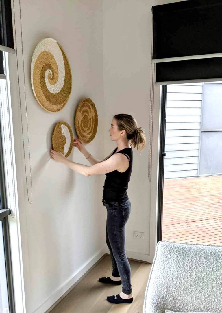
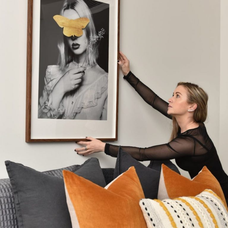
Artwork hung too high
Maybe I notice this more than others because I am a short arse, but it is absolutely up there with one of the most common mistakes people make when decorating. Art is often hung far too high for the eye to enjoy. I’ll take a rough guess at why this is… generally, the men of the house hang artwork, and men are generally taller than women so they generally hang it to a height they see fit – generally (pardon the sexism).
While I’m at it, the same rule applies to your TV. I see far too many TVs causing creeks in necks because they are hung like a cinema screen for the benefit of the person cooking in the kitchen! Why do you think TV units are all around 50-60cm high? This is the optimum viewing height while sitting. You’re not at Hoyt’s now guys, you’re home, get comfortable.
Solution
Hang your art at eye level, but this does not mean YOUR eye level. “Eye level” is around 1.5m from the ground to the centre of the art. You can read more about hanging and choosing artwork in my blog “how to choose art for your home“. Art is supposed to be enjoyed while standing and panning a room. Don’t hang your art higher just because you have tall ceilings or long legs! Hang your TV at eye level while sitting, not standing.
Don't fall for the package deal!
We all love a good bargain, am I right? Nothing feels better than leaving a shop, thinking you got a better deal than the other shoppers. Your offer was “exclusive and unique” to you only. It’s a no brainer why you bought the matching bed, bedsides and chest of drawers to save yourself some cash and any further decision making.
If you don’t know already, I come from a furniture management background and I can tell you with certainty that this is the oldest trick in the book. Furniture shops always go on sale (excluding high end), and if they are not, just ask for the sale price!
Solution
Matchy-matchy furniture gives me the sweats. It feels boring, unplanned and dated. You will never find me buying two pieces from the same range unless they are in different rooms. Change it up for textural interest. A room should have a mixture of hard, soft, matt, shiny, rough and smooth finishes. Go for an upholstered bed, with wooden bedsides and a complimentary chest of drawers in a similar wood tone – but not the exact match. You cannot clash hard materials with soft materials, so loose the fear.
Choosing the wrong scale for your room
The scale of your furniture within your space plays a huge factor in the success of the room. There is nothing worse than walking into a grand home to find poly pocket furniture and decor. Or worse, going into a smaller home, to realise the house was built around a giant sofa!
The most common items people scale incorrectly are sofas, rugs (usually too small), coffee tables (usually too small or wrong shape), artwork that gets lost or overpowers a room, ornaments (too skimpy) and lighting (too bold or not bold enough).
Solutions
Make sure you measure, before you purchase any furniture! Think about the scale of your room, and choose your pieces accordingly. If you add art to a wall and it feels lost, double it up or create a few pieces in a row/stacked/collage. If your rug isn’t larger than your sofa, it’s wrong. If your coffee table can’t be reached easily from all sofa positions, go bigger. If your sofa takes up your walking space, chuck it on Marketplace and start over.
You can read more tips on how to work with larger scales in my blog HERE.
Source: Pinterest
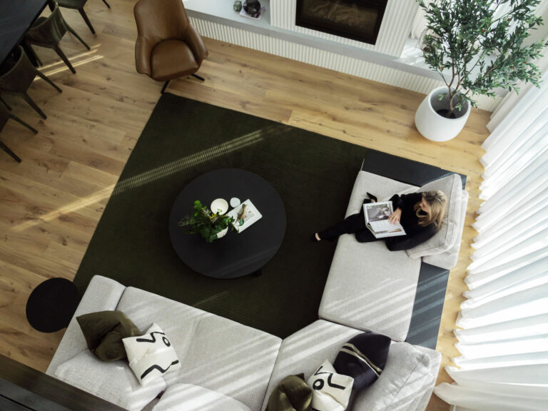
No rugs used to ground furniture
It was hard writing that title, but it’s even worse seeing it in real life and I see it all the time! Rugs are simply non-negotiable with me. They add warmth and luxury to your space, zone an area, add texture and provide visual interest. The only time I might let you away with no rug is in a smaller bedroom that already has a carpet or under a dining table (I am not the biggest fan for practical reasons).
Generally, people don’t go for rugs because;
a) they have children
b) they have a dog
c) they have a carpet and think you cannot put carpet on top of carpet…yes you absolutely can!
d) consider them high maintenance.
Solution
There is a rug for everyone and every household, it’s just a matter of finding the right one for you. Have a read of my other blog “How to choose a rug” to help you understand size, style and placement.
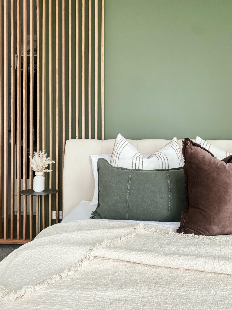
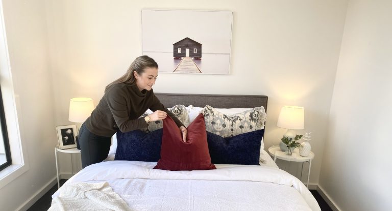
Not enough cushions used on the bed
This one makes the men run! If they are anything like my partner, they just won’t understand the need for that many cushions. If I didn’t know what I know, I’d agree with them on the practical side of things. But I do know what I know, and that is – cushions are everything when it comes to bringing a room together!
Your cushions are your chance at bringing some excitement and life into the bedroom design. You can draw colours out from the artwork, use different textures for visual interest or play with scale to create volume and luxury. Or…you can do it all!
The biggest decorating mistake I find with cushions is the lack of them, or poor filling choice (say no to flat foam). Cushions work better in repetition and personally, I prefer symmetry.
Solution
Here are my two go-to options for adding cushions to a king or queen size bed.
Poor lighting choices
Generally, lighting is an afterthought to a home design when it really should be a priority. Whether you are at the building stage or decorating stage, lighting should be thoughtfully planned for each space based on the tasks required per room (cooking, reading, relaxing etc).
The most common error I see is the wrong temperature of light or inconsistency of lighting temperature used. Cool Blue light is great for completing tasks that require bright light, while warm Yellow light is best for relaxing.
When building, people often “run out of budget” by the time it comes to the lighting and they tell their builder to do what they can. The below image is an example of this. My client left the lighting plan to their builder and look what happened! What a bizarre place to put a pendant light!
Solutions
Prioritise your lighting while you are planning the rest of your build and furniture spatial layout! You’ll need to know where certain furniture is going, so that you can add a light fitting above if needed (eg. over a dining table). Aim for 3 different sources of light within each space so that you can create different moods. Spotlights everywhere are the lazy way out and create harsh lighting. Go for a dimmer option wherever you can, and hire the right people to help you. Read more about “How to choose the right lighting for your home” in my blog HERE.
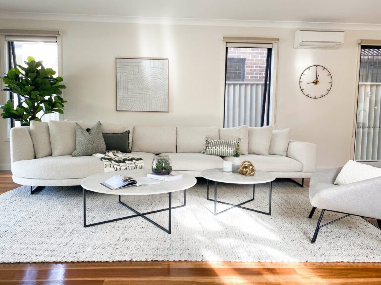
Poor spatial planning
Spatial planning is one of the most important stages of the Interior Design process and should be carried out above all else. Spatial planning is the foundation of the rest of the project, ensuring all of the pieces of the puzzle will fit.
The number one mistake I see is people shoving their furniture up against the walls leaving this big awkward space in the middle. I also see big open gaps between seating arrangments which I am told create “walkways” and “easy access” around the space. Unless you are visually impaired, you don’t need to have a thoroughfare through your living room. Try adding 5 seconds onto your journey, and meander around your furniture gracefully.
Solutions
If you have the room, don’t be afraid to take the sofa away from the wall, and ground it with a nice big rug (like below). It’s okay to create access points, but they don’t need to be obvious. Read more about spatial planning HERE.
No focal point or statement pieces
A focal point is something that catches your eye when you first enter a room. It sets the tone for the rest of the interior and starts the visual journey through the space. For me, this is the first item I pick/design within a room, allowing everything else to flow off it. It can be a piece of art, an oversized light, a unique table material, a bold feature wall or even a sculptural armchair. This hero item is generally one of the biggest investments in the room.
Quite often, I enter homes to find no focal points. The room feels flat and your eye doesn’t know where to focus. Items compete with one another for attention making the space feel unplanned.
Solutions
Pick something with a strong presence that you love. Whether that’s a piece of art or an armchair you inherited from your grandmother, and revolve everything around that piece. Keep your focal point clutter-free, so that your eye zooms straight to the point. And try to avoid your television becoming the focal point, which happens more often than not.
Three Birds Renovation use off-centred light fittings as focal points.
Buying things sporadically.
I too, am guilty of this one! You find a great deal or something shiny that catches your eye, and you buy it without really thinking about whether or not it will truly work in your house. You take it home and it looks terrible! I’ve seen many hotchpotch homes where pieces of furniture/decor have been purchased over the years but nothing really works.
I did this at Christmas time last year, knowing I was going to have guests, I felt the need for a new armchair. I purchased it (because I got a great trade price), but when I got it home, it just looked awful. The style was very cool and the fabric was a gorgeous boucle, but paired with my textured sofa…it was too much and felt heavy. The chair lasted around 8 weeks at my home before I flogged it on Marketplace!
Solutions
Plan everything in one go if possible. If you don’t do mood boards, start now! Mood boards can be created on any presentation program or Canva. You need to see everything down on one page to understand visually if things will work well together.
Measure up too, do NOT buy furniture without measuring. Take your time, sleep on it and buy it only when you know it’s right.
My short lived chair. I hope he's looked after wherever he is now...
And that’s a wrap folks! I hope you learned a thing or two from this blog so that you don’t make the same mistakes others have. If you are building or renovating your home, get in touch. I’d be happy to help you prevent expensive design mistakes.